Increasing site visitor engagement with Drift’s widget
Category
- UX Design
- Visual Design
- User Research
Role
Product Designer
Date
Feb 2023 – Oct 2023
Collaborated with
Alex Hanthorn, Adam Federschneider, Jamie Connor
Overview and impact
- The project: Transforming Drift’s core B2B conversational interface from a traditional text-based chatbot into an open, multi-utility widget framework.
- My role: Lead Product Designer (User Research, UX Strategy, Visual Design). Facilitated cross-functional design sprints and aligned executive stakeholders.
- The impact: Re-engineered the platform's core site-visitor interaction model. Our early pilot on Drift.com validated the framework, visitor engagement exploded from a 1–2% historical baseline to 12% for instant calendar scheduling and 21% for resource interactions.
The challenge and strategic context
Across the B2B tech sector, standard chat widgets faced a severe ceiling, averaging a low 1–2% engagement rate. For Drift, this translated into a product challenge: 29% of churned customers explicitly stated they were leaving due to a lack of demonstrable ROI.
Previous product teams had previously tried optimization tactics like dynamic conversational “hooks” and entry animations, but these changes failed to move the metric. Our team was tasked with rethinking the widget’s value proposition to dramatically increase visitor engagement, accelerate sales pipelines, and directly defend customer retention.
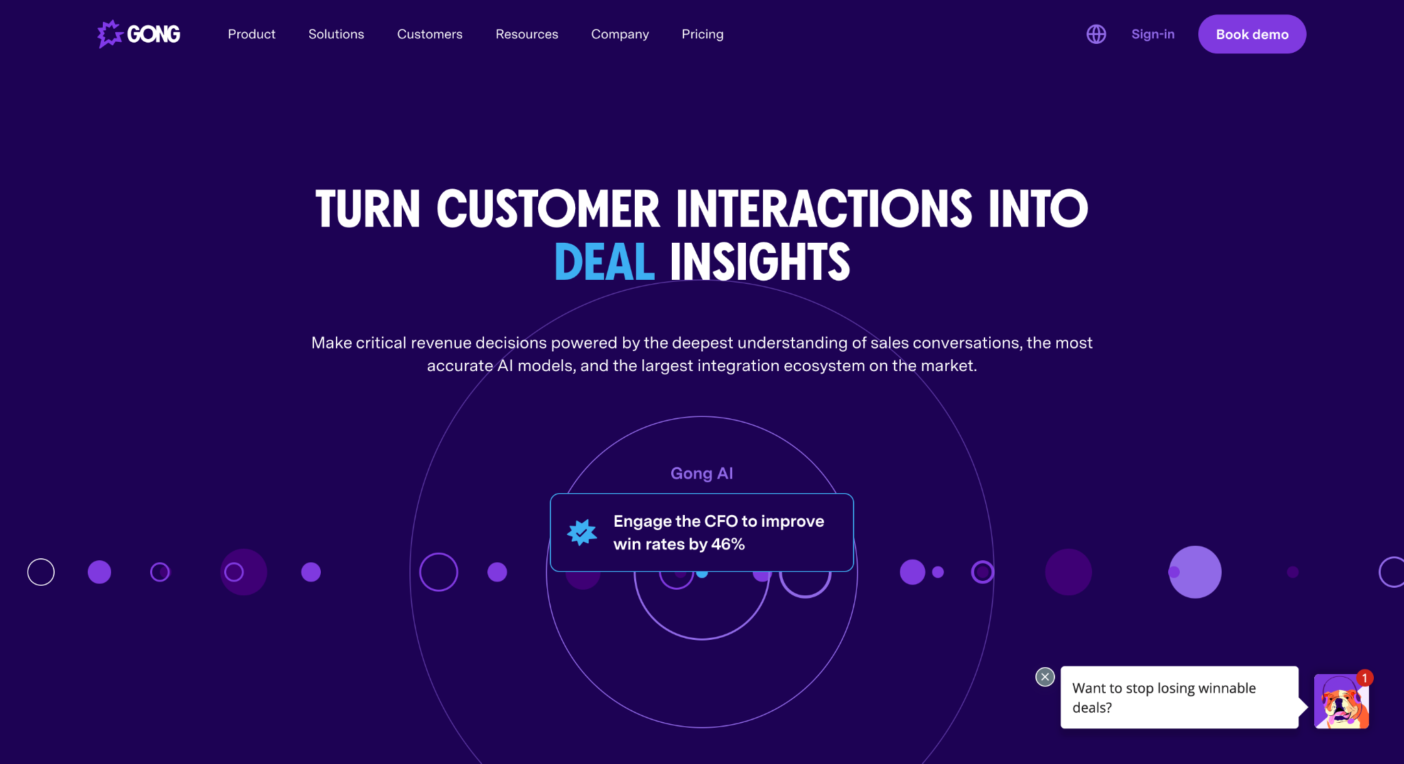
An example of Drift’s widget on Gong’s site in 2023. Chat widgets have become commonplace on both B2B and B2C sites. The first message that appears is referred to as the “hook” or preview.
Uncovering the friction between buyer and marketer
I initiated our discovery strategy by conducting deep qualitative research with verified B2B buyers who had recently evaluated enterprise software solutions exceeding $10,000. Our research showed that buyers were simply tired of chatbots. They felt like glorified email-harvesting forms rather than helpful tools. Buyers demanded immediate information transparency, interactive product walkthroughs, and frictionless access to humans when they were ready to chat.
"I'm not the type of person who uses chatbots. I don't have the patience to answer yes or no questions..."
– Research Participant
Simultaneously, an industry audit of 345 competing conversational tools on G2 made it clear that standard chat had become completely commoditized. To win, Drift had to shift from a conversation-forcing bot to a self-service utility engine.
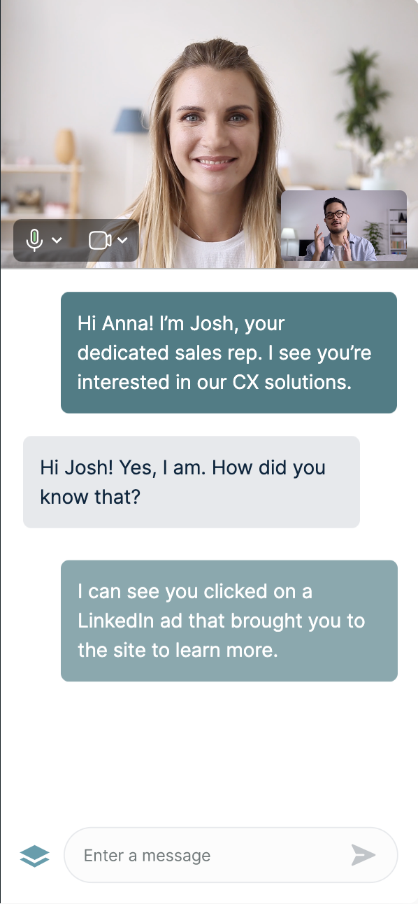
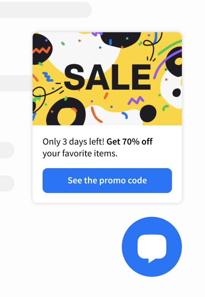
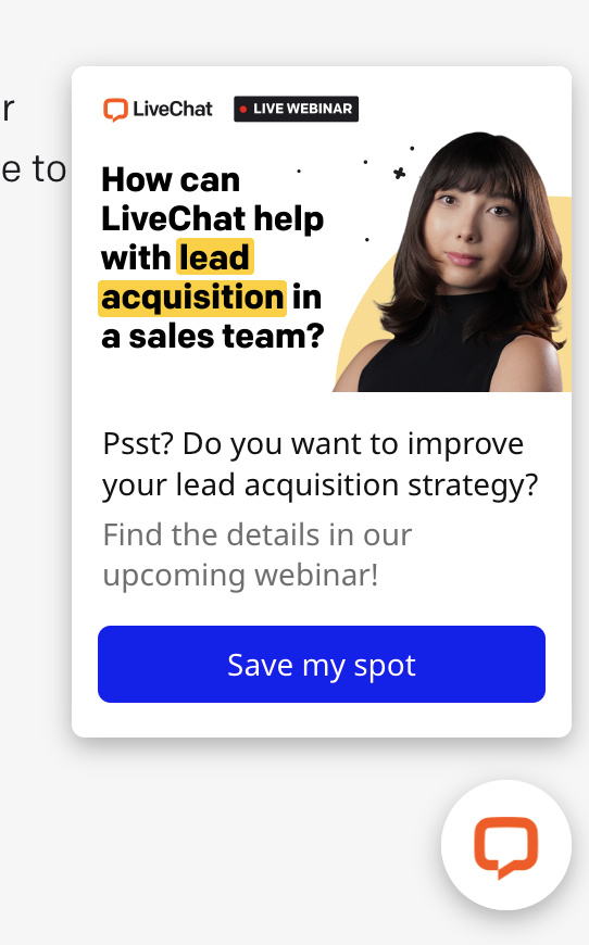
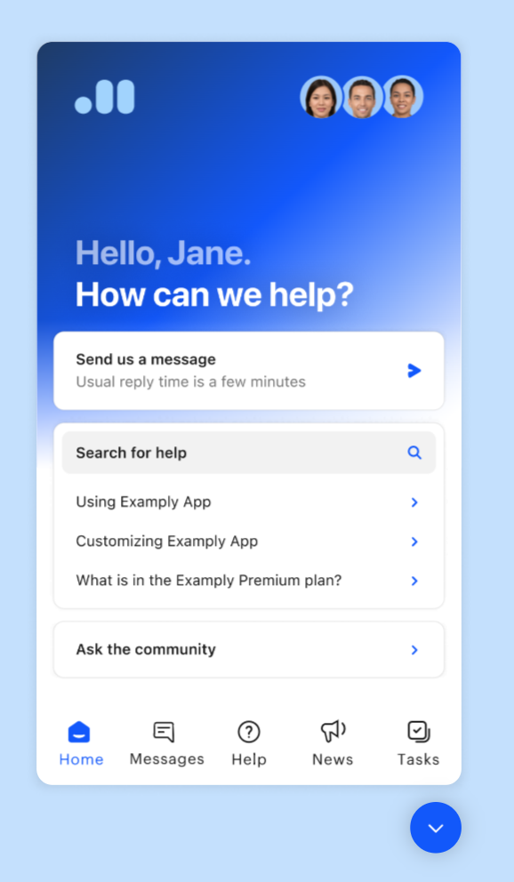
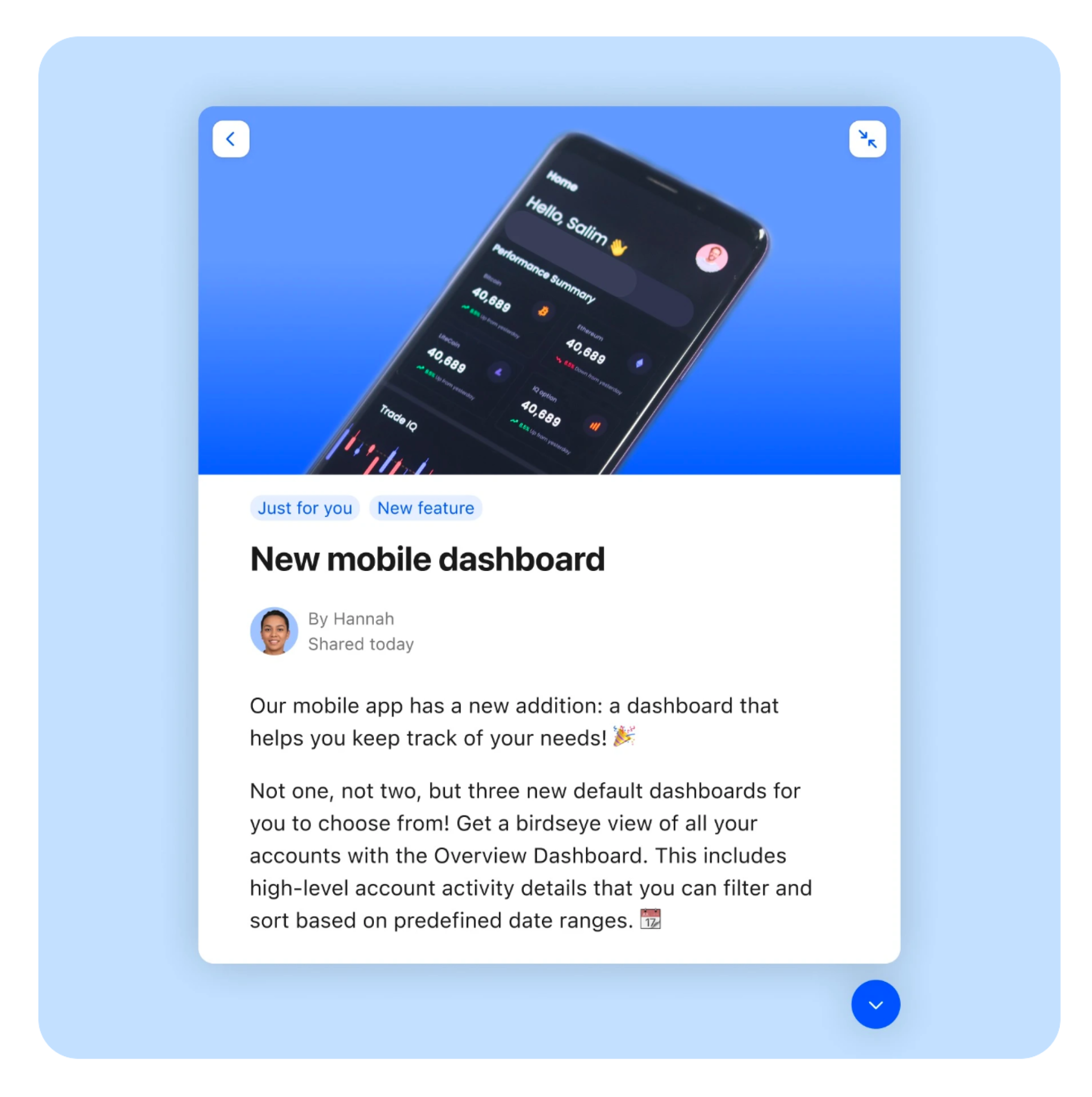
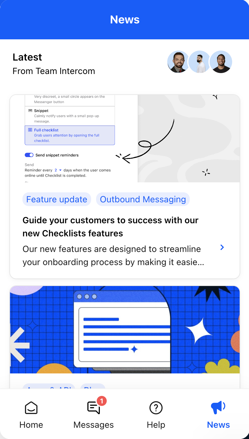
Competitor’s widgets displayed dynamic data to engage site visitors. The idea here seems to be that providing different content may give a site visitor new reasons to chat or click in.
Facilitating the design sprint: From "Door" to "Window"
To navigate this paradigm shift, I structured and led an intensive cross-functional design sprint with our core team and leadership. We synthesized our user research through a "Crazy 8s" exercise and generated three architectural concepts to test across isolated buyer cohorts: a Spotlight-style search, a hidden sliding assistant drawer, and an exposed multi-button layout.
The user testing results were definitive: 3 out of 4 buyers selected the exposed design as their top choice, with the remaining participant ranking it second. Buyers noted that exposing options transparently on load immediately signaled that the widget was an actionable resource center rather than a standard chat bot. We were hiding our power behind a closed door; we needed to turn that door into a window.
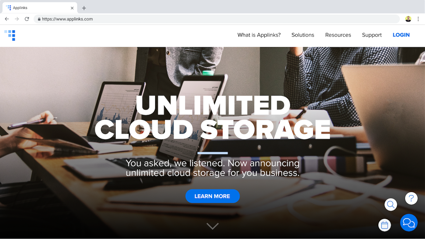
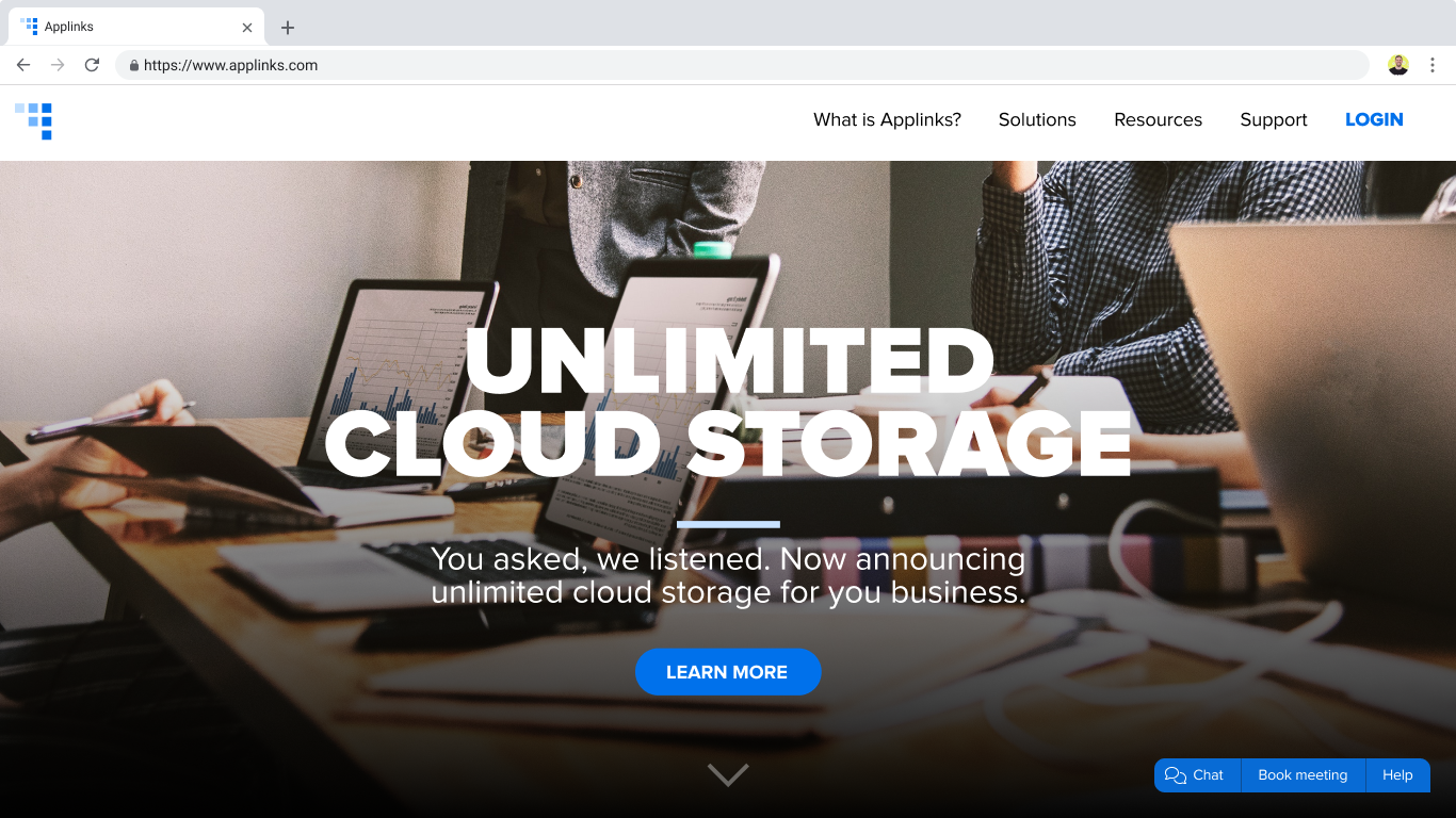
We prepared two sets of designs to share during our user research. Each set had a version of search, hidden assistant, and exposed multi-button. These designs are the two versions of multi-button that we presented. This design concept won across buyers AND marketers. You can view all prototypes from cohort A here and all prototypes from cohort B here.
While buyers were excited by easy access to more actions, marketers (our actual customers) were understandably hesitant. They loved letting high quality pipeline skip the chat, but expressed concern over unqualified site traffic overloading their sales reps' calendars. This meant we needed to make sure site visitors saw the widgets that were right for them. Knowing this, we wanted to extend our current targeting conditions to whatever new site visitor experiences we were building.
The vision
Before we started building, the team wanted to check back in with leadership to share what we learned and where we thought we should head next. I built two prototypes to showcase all the actions we believed the new site conceirge should do and how it could react to site visitors' engagement.
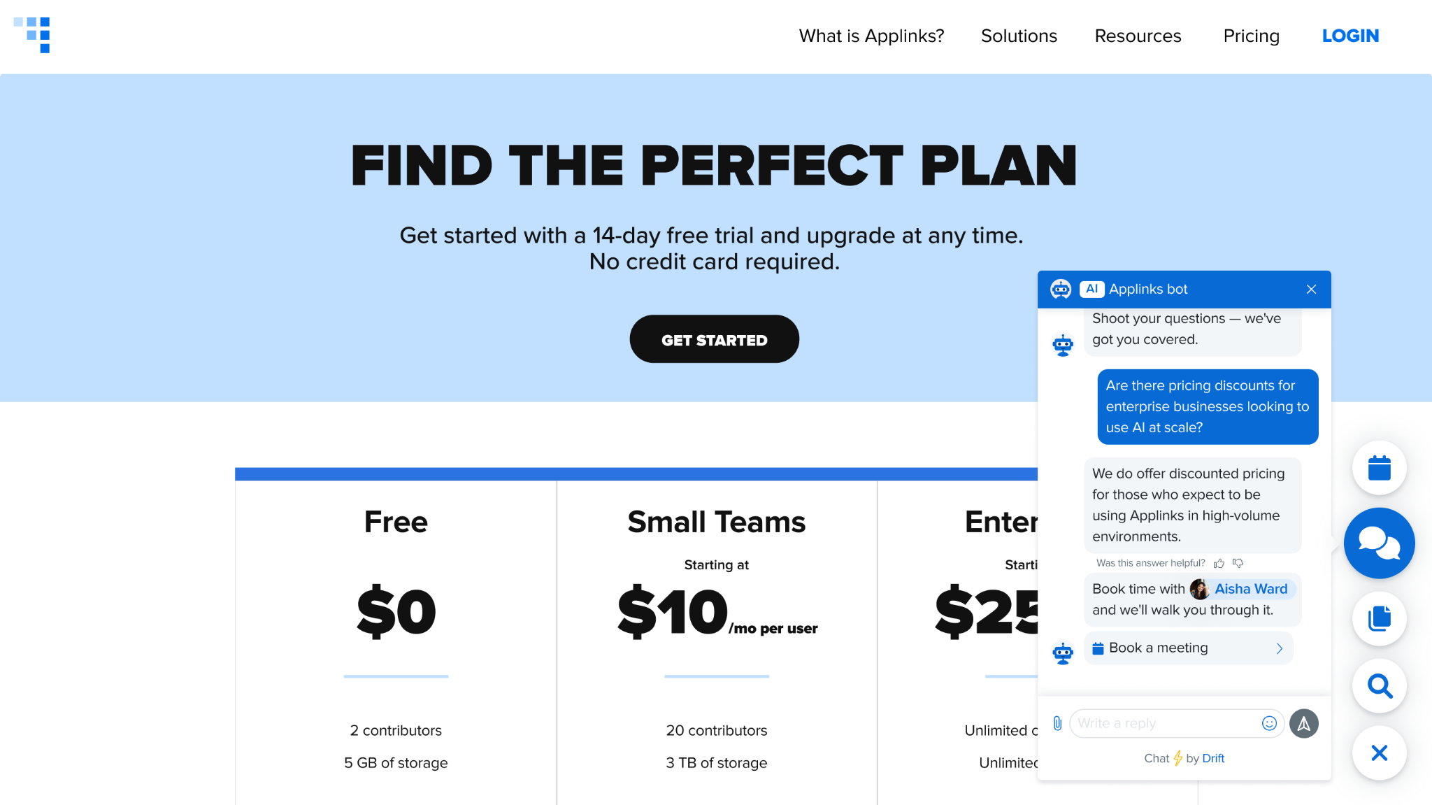
The first video shows off the different widgets we imagined a marketer could configure for any given site visitor. View the first prototype. The second image is from a prototype that showcased on the widget changed as a site visitor interacted with the site. As they became more qualified, they unlocked new widgets. View the second prototype.
Shipping fast to test and learn
With leadership's buy-in, it was time to test our hypothesis on our own site visitors. To de-risk production timelines, I partnered with my PM and Engineering Lead to break our expansive product vision down into two lightweight, high-yield production experiments using our existing backend infrastructure:
- Targeted Meeting Shortcuts: When a site visitor matches an enterprise customer’s strict qualification criteria, the widget bypasses the chatbot completely and exposes an explicit, high-priority "Book a Meeting" utility button.
- Contextual AI Recommendations: To drive content consumption without manual marketer setup, the widget monitors reader engagement and dynamically slides open an AI-curated resource preview card once a visitor completes 70% of a page scroll.
To ensure a smooth launch, I partnered with our engineering team to construct an interaction-focused QA testing matrix. By translating structural visual layouts into explicit, text-based interactive statements, we successfully identified and resolved backend data complexities and performance constraints well ahead of code freeze.
Since this was a pilot test, defining success was key to decide if we would move forward. We decided to measure the following metrics:
- Measuring the engagement rate of each button per playbook sends.
- If adding the meeting booking button only increased engagement in chat, that is still success.
- For meeting booking, also measuring engaged → meeting booked
- Potentially see further increase when non-chat book a meeting experience is shipped.
- For AI recommendations, also measuring click through rate and impact to time on site. Use this data to continually train AI.
- Making sure widget load times do NOT increase due to changes, look for performance boosts throughout process.
Early results
1-2%
Engagement with chat pre-test→
12%
Engagement with meetings21%
Engagement with recommendationsThe resulting pilot on Drift.com confirmed our product strategy, generating double-digit engagement leaps and redefining how the company approached its core widget roadmap.
Retrospective
Overcoming the "blank box" cognitive load
The core realization of this project was that if users don't explicitly know what an interface is capable of doing, they won't know where to start. Hiding features behind a text-prompt barrier places an immense cognitive load on the user. By changing the widget from a closed "door" to an open, transparent "window," we proved that giving people a clear glimpse of what is possible helps them get where they need to, or even takes them somewhere new.
This principle applies directly to the AI tools of today. We cannot simply drop an open-ended conversational input field in front of a user and expect them to know how to unlock its value. As designers, we need to design contextual scaffolding — using progressive disclosure, dynamic suggestion states, and exposed utility options — to guide users from curiosity to adoption.
Previous project
Transfers at StashNext project
Mobile app at Rho