Simplifying the transfer experience at Stash
Category
- UX Design
- Visual Design
Role
Product Designer
Date
July 2024 – Oct 2024
Collaborated with
Lisa Fincham, Deepika Goel, Mathieu Alvado, Kyle Robitaille
Overview and impact
- The project: Building a unified, universal capital movement framework across mobile and web as part of a comprehensive app refresh.
- My role: Lead Product Designer. Partnered with PM, Engineering, and internal Compliance stakeholders.
- The impact: Removed fragmented legacy flows by designing a predictive, single-screen transfer experience. This universal experience eliminated multi-click drop-offs, modernized account movement, and contextually surfaces high-value recurring deposit CTAs to increase retention.
The challenge and strategic context
Moving money is the most important thing a user does on Stash, but our transfer setup was completely fragmented. Depending on where you clicked in the app, you got an entirely different screen. It took over seven clicks just to make a basic transfer. Over time, different teams had introduced massive design debt.
The legacy interface suffered from compounding design debt: confusing, unaligned copy ("Available cash" vs. "Available to transfer"), visual hierarchies where structural labels completely overpowered the active financial data, and a transactional layout that asked users for an entry amount at the very end of the flow rather than the beginning. The challenge was not just to redesign a form, but to establish a universal interaction pattern capable of scaling across every account type on the platform.
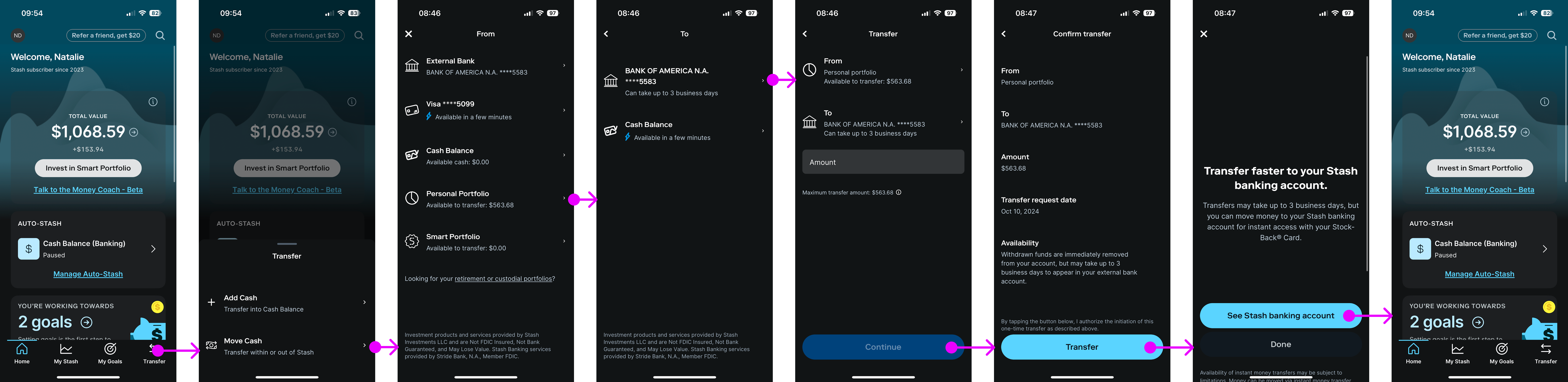
This is just one example of a money movement flow within Stash, but you can see just how arduous these flows could be. This one takes seven clicks to complete, creates confusion with "Add cash" versus "Move cash" and "Available cash" versus "Available to transfer," visual hierarchy that doesn't align to actual importance of information, and doesn't follow the mental model of moving money.
Step 1: Align content for a quick win
When I first began looking across all our transfer flows, I realized we weren’t even using the same vocabulary — a problem exacerbated by different designers creating different flows for their part of the product.
After auditing the entire platform, I put together a proposal for our compliance team that would create one source of truth for what words we used when talking about money movement. After reviewing, I also shared with the Product and Design team to make sure everyone knew the new rules we were implementing to simplify transfer flows.
This allowed the team to reduce cognitive load as users went through any money movement flow with negligible engineering effort.
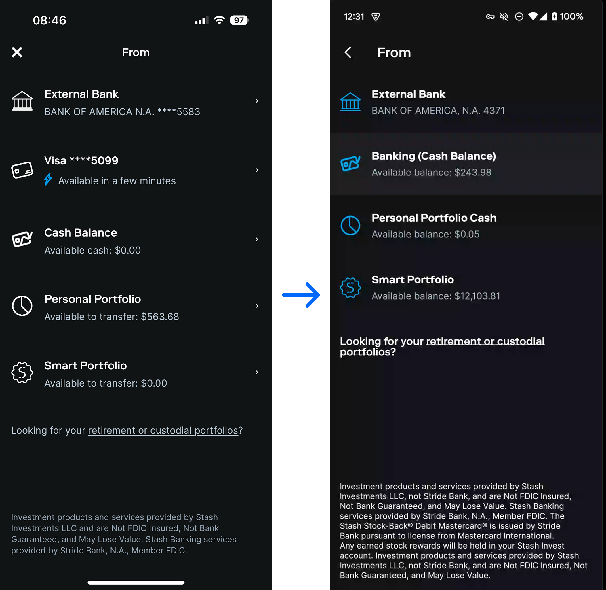
While no visual updates were made with this first ship, we managed to reduce cognitive load with about 1 day of engineering time. It was now always “Available balance” instead of “Available to transfer,” “Available cash,” or “Available in a few minutes.”
Step 2: Designing a universal transfer experience
Creating a universal transfer experience meant pulling heavily-regulated accounts that are each governed by different settlement speeds, withdrawal rules, and fraud prevention windows into one single, standardized interface. Because each account type carried unique back-end constraints, our engineering lead and I shared the same high-level goal: we wanted to build a single experience, but we had to find a way to do it without creating a fragile code architecture.
I started by rethinking the flow of information, aligning to the user’s primary intent: amount first, source and destination second. I turned the multi-step journey into one, responsive screen. Optimizations included:
- Elevating the amount field to the highest level of the visual hierarchy.
- Restructured the "To/From" account selection sheets with categorization.
- Progressively disclosing regulatory and limit information based on users' inputs.
Please note: This video was recorded on an emulator so keyboards don't appear as they normally do.
Watch walkthroughStep 3: Adding Auto-Stash
Just like with Goals, one of Stash's goals was to increase the percentage of users with recurring deposits turned on, which was a leading retention indicator. If the user selected a combination of accounts that allowed, an Auto-Stash module seamlessly appears. This reduces visual noise and also made sure users only see the option when it is available.
Please note: This video was recorded on an emulator so keyboards don't appear as they normally do.
Watch walkthroughBy utilizing this flexible architecture, we successfully accounted for every operational edge case across our account ecosystems while strictly maintaining the frictionless, single-screen experience the entire team was pulling for.
Step 4: Using new flow everywhere
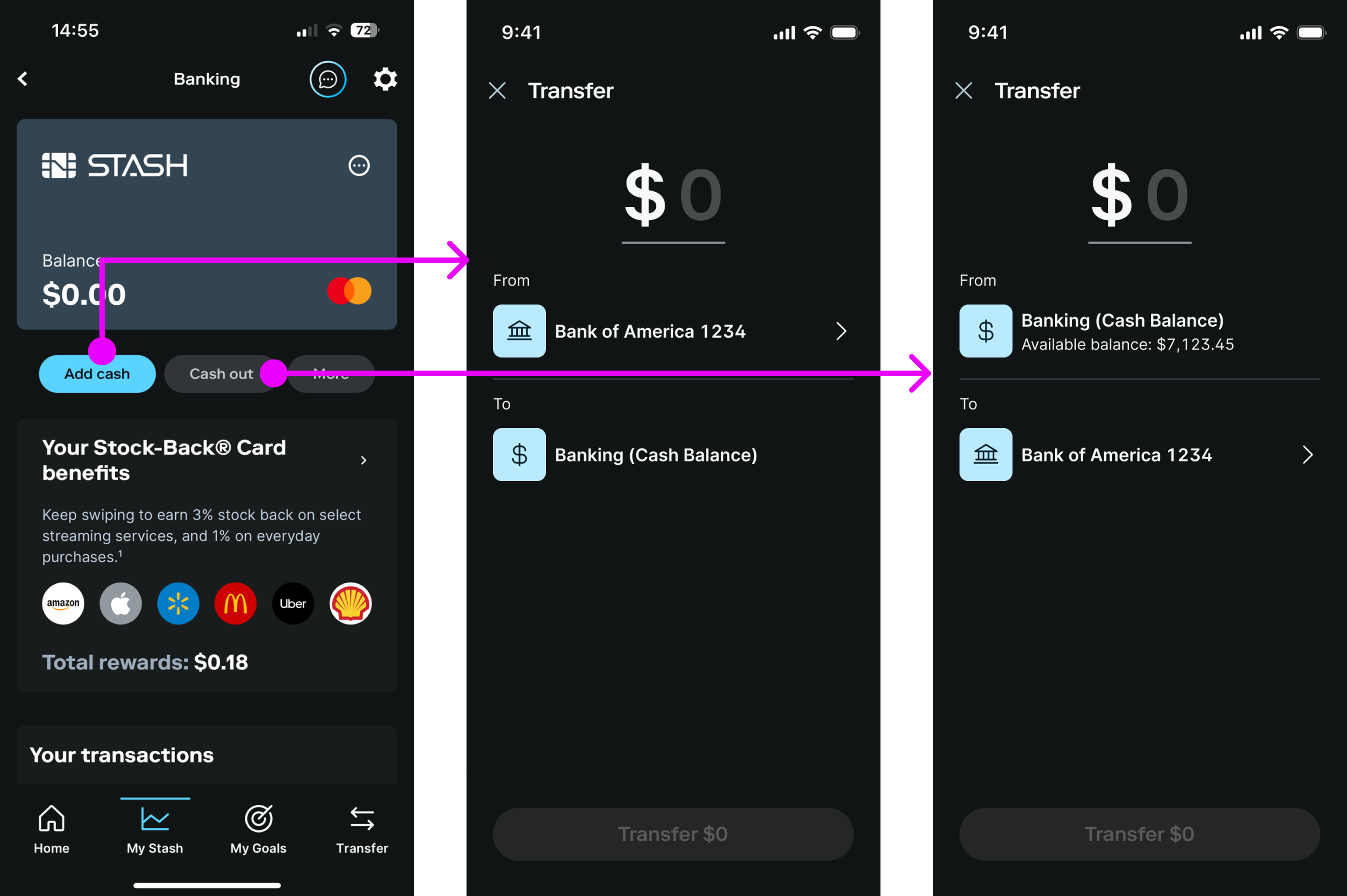
The last step of this project was directing all money movement flows to this new experience. When a user clicked a CTA, the transfer flow would pre-fill assumed fields. I worked with Engineers to create user flows for both the happy path (pictured) and edge cases (shown in Figma file). This was the final step to give users a consistent and friendly interface to move money in all directions: on to, off of, and within the platform.
Retrospective
Simplified experiences are a win for everyone
Collapsing several complex money movements flows into a simple, one screen experience doesn’t just help users move their money faster, it reduces code complexity. Initially I didn’t realize that engineering would also want to tackle such a large overhaul, but for them it also meant less code to maintain!
Always look for ways to break down the problem
Fully redesigning and rebuilding the transfer flow took months, but as a team we found opportunities to ship smaller pieces to deliver customer value quicker and to test some of our bets. By the end, we still shipped a highly resilient system framework that scaled alongside future updates, but customers saw improvements incrementally.
Previous project
Goals at StashNext project
Reinventing the chatbot