Reimagining mobile for start-up founders at Rho
Category
- UX Design
- User Research
Role
Product Designer
Date
Aug 2025 – Feb 2026
Collaborated with
Jan Ignasik, Christina Manzo
Overview and impact
- The project: Transforming Rho’s mobile app from an employee expense tool into a strategic command center for startup founders.
- My role: Product Designer. Proactively collaborated with product and engineering stakeholders.
- The impact: Designed a long-term information architecture vision that shifted platform utility toward corporate decision-makers. Drove mobile app adoption among VC-backed founders from a 39% baseline to 47% in just a few months. Successfully built a mobile deposit flow that consistently captures over $7M in new capital every month.
The challenge: Misaligned target persona
Rho is a robust business banking and treasury platform built for high-growth companies. However, its mobile application suffered from severe operational misalignment: it was historically built for entry-level employees to snap photos of receipts and access virtual cards.
Meanwhile, Rho’s overarching business strategy shifted to target a younger, hyper-mobile demographic: the on-the-go Gen-Z startup founder. This segment treats their business finances with consumer-grade expectations; they demand absolute mobility without needing to pull out a laptop.
When I audited the legacy application, I found massive design debt:
- Hidden core utility: High-value banking information was buried at the tail end of the navigation menu.
- Fragmented to-do lists: Admins were forced to navigate two entirely separate, disconnected tabs for "Tasks" and "Approvals".
- Information overload: The home screen prioritized administrative chores over macro financial health, forcing founders to manually scroll just to check their company balances.
Screen recording of an old Figma prototype, animation is not correct.
Strategic discovery: Mapping the founder mental model
To ground my design strategy in real user behaviors, I conducted competitive research spanning direct business banking rivals (Mercury, Ramp) and premier consumer finance apps (Robinhood, Wealthfront) to establish our UX north stars.
My discovery synthesis identified a critical binary in the founder persona:
- The gut check: Founders frequently opened the app for a split-second assessment of their financial health. Do we have enough runway? Is a department overspending?
- The power action: While traveling, founders need to immediately execute high-stakes operations, such as approving a $1,000,000 wire or instantly locking an employee's compromised credit card.
Based on these pillars, I proposed a comprehensive, 1-year product vision to overhaul the app's Information Architecture. Once I secured cross-functional buy-in from leadership, I broke the massive roadmap down into highly strategic, incremental production ships.
View vision deckThe incremental rollout strategy
Update 1: New admin command center
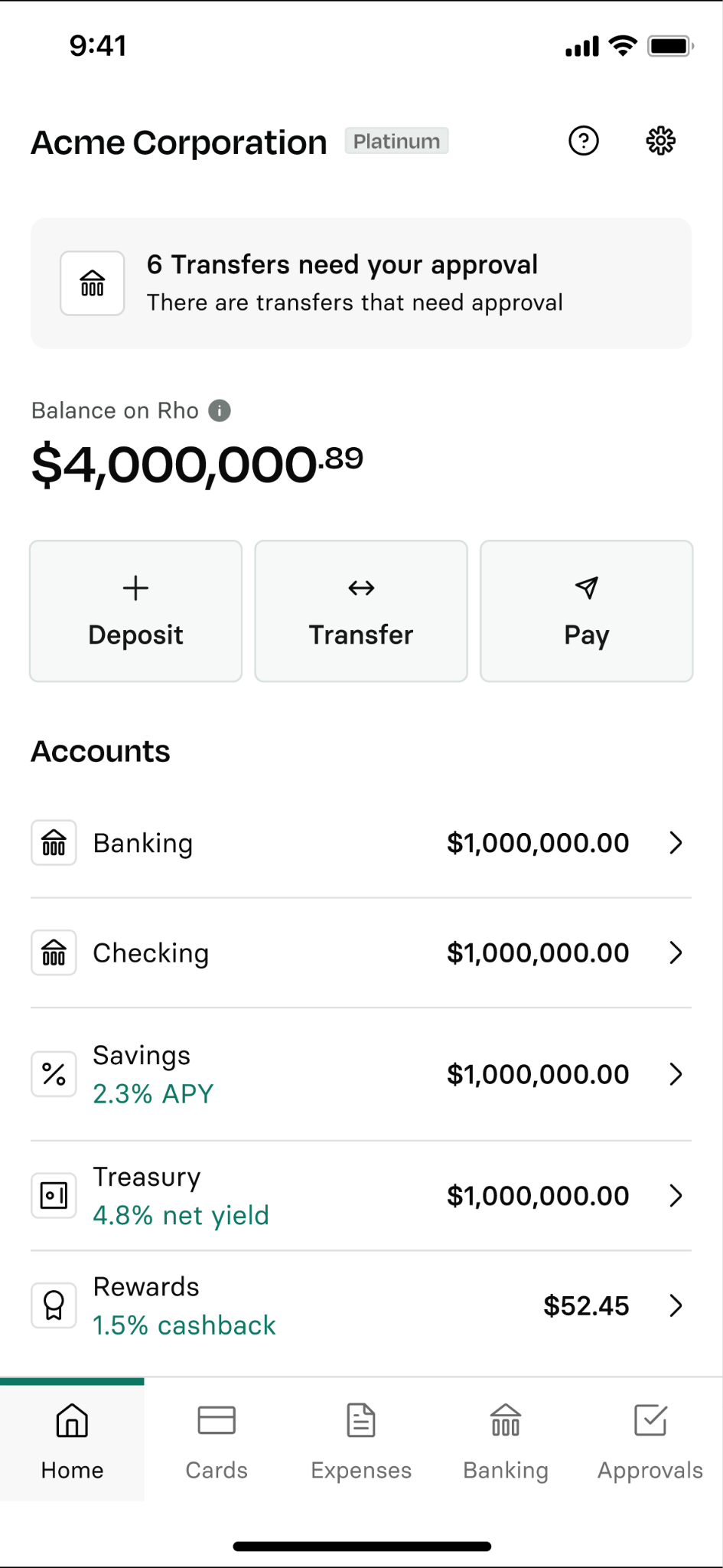
I completely flipped the core hierarchy of the home page to satisfy the "Gut Check" mental model. I elevated the core company balance to the absolute top of the page—completely above the fold—and integrated real-time spending data visualizations. Directly beneath this macro financial state, I placed prominent, immediate quick-action CTAs ("Deposit," "Transfer," "Pay"), turning a passive dashboard into a highly functional tool with zero scroll friction.
Update 2: Unlocking deposits
Historically, the mobile app restricted capital inflow to traditional checks and wires. Recognizing that founders expect frictionless money movement just like on the web, I designed an end-to-end mobile funding flow integrated with Plaid. I mapped custom interface validation states for successful links, processing delays, and technical errors. Since launch, this single mobile optimization has driven over $7M in monthly deposit volume.
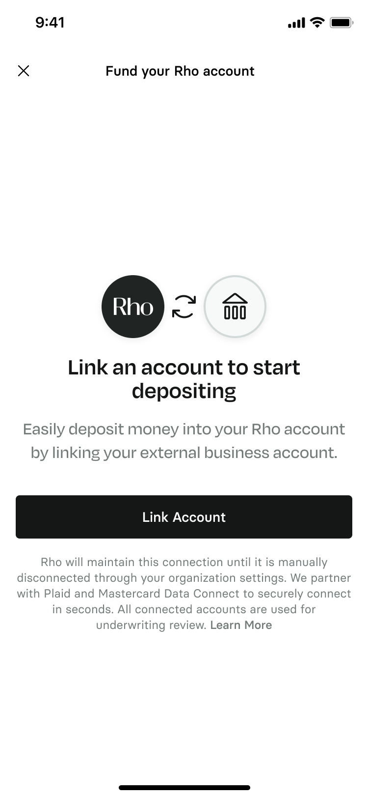
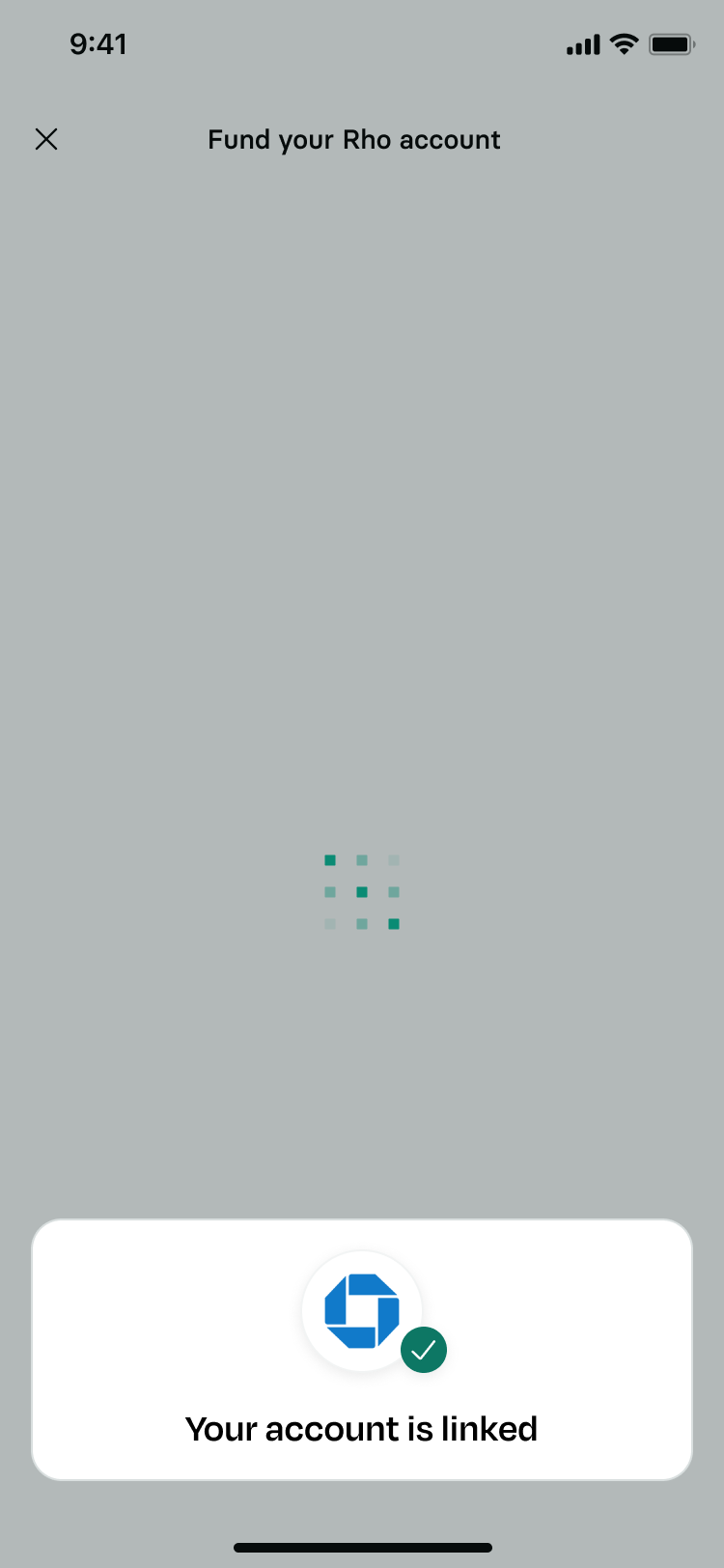
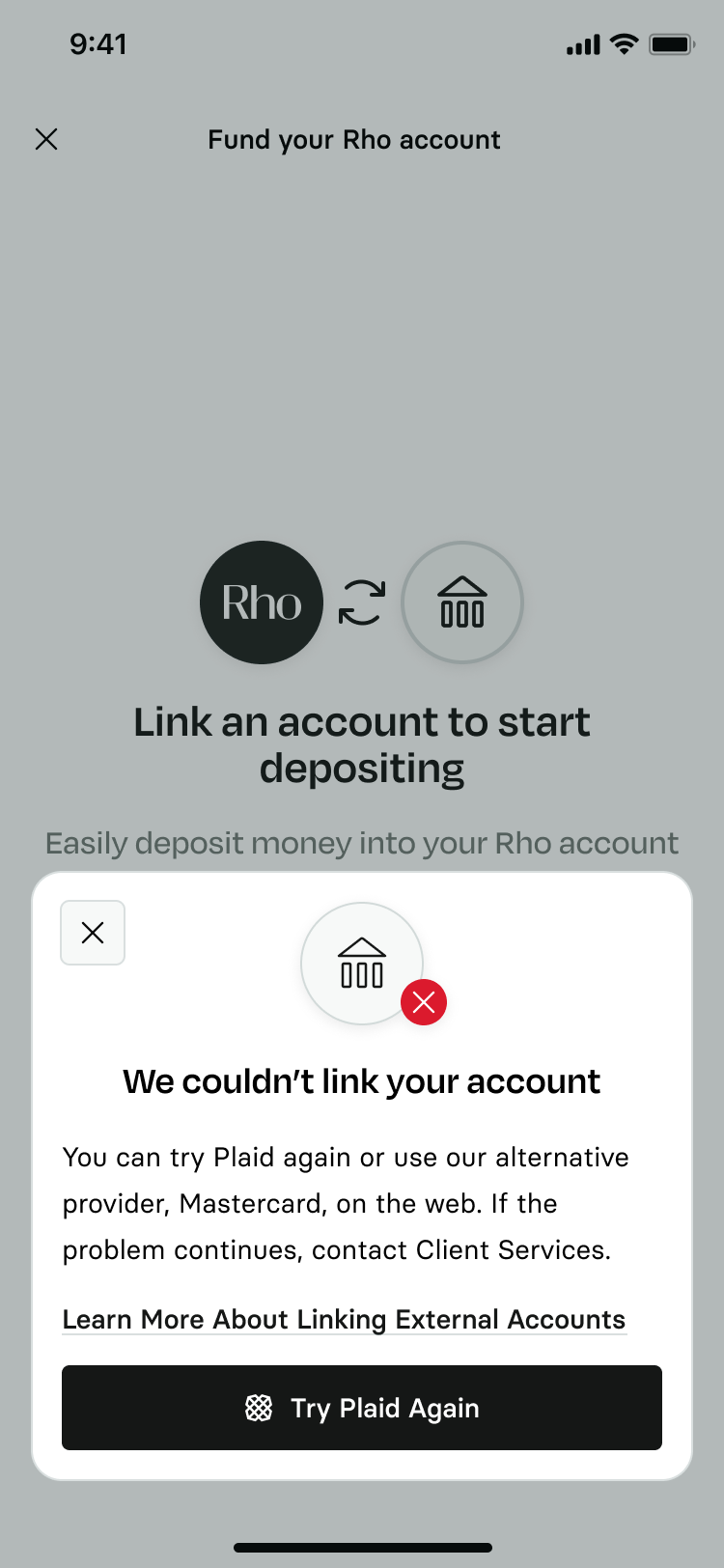
Additional screens from the account linking flow.
Update 3: Dynamic team card control
To streamline employee spend management for founders, I utilized Claude Code to rapidly prototype and ideate interaction models, accelerating our mid-fidelity testing timelines. These designs were then brought back to our original user testing cohort. They highlighted the need for both high-level insights and the ability to drill into individual cards.
I designed a credit utilization widget that sits at the top of the page, allowing admins to monitor team spending at a glance. Then below, admins can see cards by user, with themselves at the top. I also included a search bar, which we architected to let users search by cardholder, card name, or a card's number. When an admin clicks into a card, I re-architected the detail page, elevating the most frequent actions: editing credit limits and locking cards instantly. They were now immediate, top-level interactions.
Update 4: New mobile design system
As Rho began rolling out a reimagined visual identity, I leveraged the card interface as a place to emphasize the new brand and a moment of delight. The cards were not only redesigned, but I added animation based on the user's gyroscope and inject delight in the rather clinical fintech space. With the help of Claude Code I engineered a custom gyroscope-driven card animation that I was able to easily hand-off to engineers. In production, the virtual card physically shimmers and catches light as the founder moves their phone, transforming a standard corporate credit card into a piece of digital craftsmanship.
Retrospective
Design the vision, continuously ship the MVP
Being a designer at a fast-paced start-up requires balancing long-term idealism with near-term pragmatism. Presenting a grand 1-year structural vision gave the squad a north star, but breaking it down into small, high-yield ships ensured we consistently delivered business value without blocking development cycles.
Leveraging AI
There are new AI advancements every day that are changing how we are work. Embracing them enabled me to reshape the speed of user validation. By rapidly transforming static mid-fidelity ideas into functional, interactive prototypes with Claude Code, I was able to stress-test complex actions with founders far earlier in the cycle, completely stripping out technical ambiguity before official engineering handoff.
Even business banking is moving beyond desktop
Moving the needle on founder mobile engagement from 39% to 47% confirmed our internal hypothesis that B2B founders want to do even the heavy-lifting from their mobile device. The modern executive expects their entire business stack to be pocketable, and leaning heavily into speed, transparency, and micro-delight is how modern B2B products win
Previous project
Reinventing the chatbotNext project
Goals at Stash