Making financial advice accessible to everyday Americans at Stash
Category
- UX Design
- Visual Design
- User research
Role
Product Designer
Date
Nov 2023 – Sept 2024
Collaborated with
Greg Pogue, Lisa Fincham, Amit Sharma, Deepika Goel, Stella Tu
Overview and impact
- The project: Redesigning and transitioning a legacy, low-utility budgeting feature into a highly strategic, investment-driven automated "Goals" ecosystem.
- My role: Lead Product Designer. I cross-functionally steered this initiative alongside PM, Engineering Leads, and our Chief Investment Officer (CIO).
- The impact: Designed and launched an MVP that drove a 300% increase in feature engagement, scaling adoption from 11,000 goals created in 2 years to 48,600 in just 5 months. By strategically embedding deposit loops, 24.6% of goals converted to recurring deposits, capturing 16,000 new recurring deposits within the first 5 months.
The challenge and strategic context
Stash’s legacy goals feature was an isolated budgeting tool that essentially locked cash in interest-free partitions. It suffered from exceptionally low utility (only 11,000 goals over two years).
Task analysis and user research exposed a critical market gap: novice investors expected personalized guidance and clear progress tracking, but found a dead end. Leadership challenged our team to convert this friction into a competitive moat. As a Registered Investment Advisor (RIA), Stash could legally offer automated investment advice—a distinct differentiator over competitors. My goal was to design an experience that translated complex, regulated financial advice into an approachable, habitual user loop.
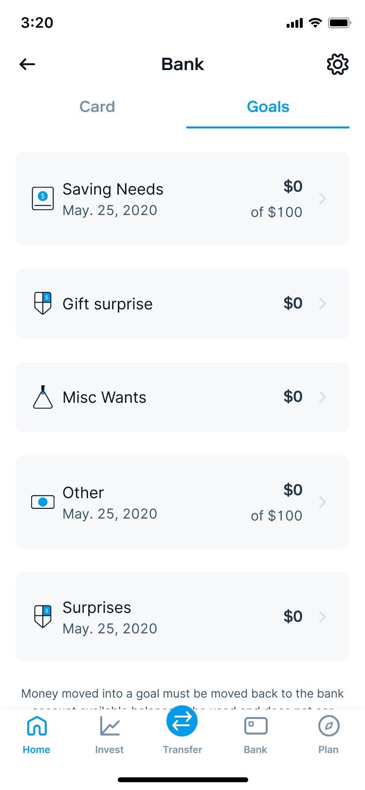
A screenshot of Stash's legacy Goals product that was live from 2022 through early 2024.
Deconstructing the market and intent
I audited 9 banking and investing platforms to map industry mental models. The market was split between rigid account-linking flows or static cash savings rules. Crucially, no competitor offered advice on where the capital should be allocated to maximize return. This confirmed that our UX strategy should focus heavily on immediate, actionable advice during the goal-creation flow.

Bank of America forced you to connect an existing account and then “allocate” money towards your goal. There was no advice.
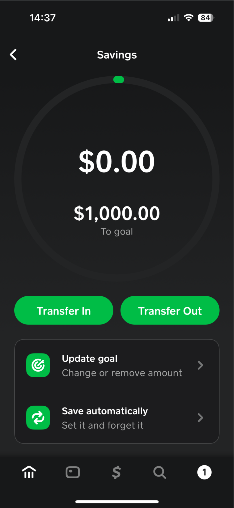
Cash App allows you to create one goal and then transfer money into it. This was most similar to the existing goals experience.
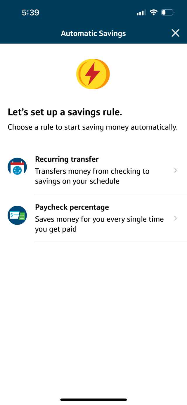
Capital One lets users create “savings rules” which automatically transfers money on a schedule. Closer to Auto-Stash than the desired goals experience.
Facilitating alignment through friction
To accelerate cross-functional alignment, I mapped out end-to-end user flows to stress-test our technical and operational assumptions early with leadership, product, and engineering.
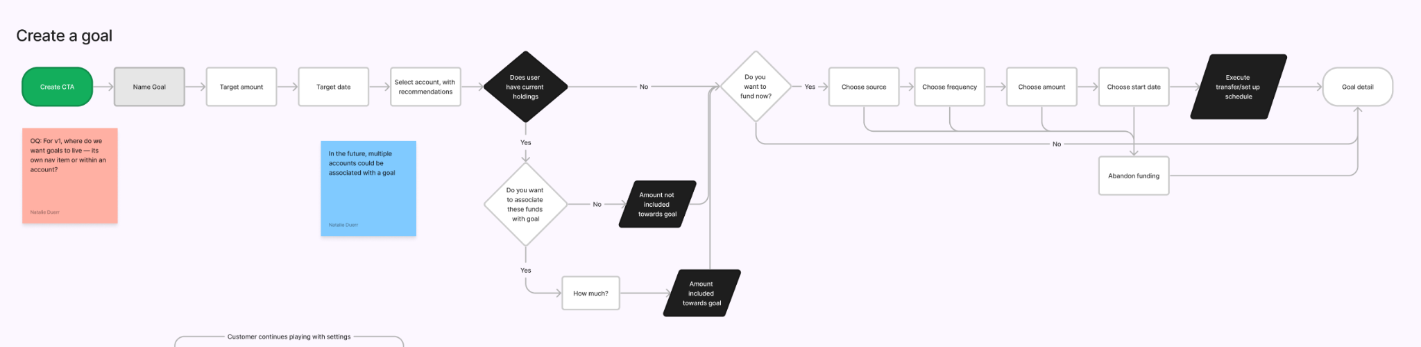
An example of one of the user flows I created to start conversations on our direction and scope.
Moving into mid-fidelity prototyping, I ran unmoderated usability testing with current Stash users to evaluate two distinct structural architectures: isolated goals versus account-bound goals. While users eagerly welcomed the concept of algorithmic advice, both prototypes revealed a major cognitive block: users misinterpreted account-linking screens as immediate, irreversible fund movements.
Links to prototypes: Isolated goals, Account-based goals
I recalibrated our MVP scope based on this friction. I recommended decoupling direct account creation from initial goal-setting. Instead, the UX would prioritize user-defined custom goals, immediately followed by clean, short- and long-term asset recommendations that I curated with our CIO. The primary CTA was then pivoted to setting up "Auto-Stash," weekly recurring deposits, aligning the users' wealth-building habits directly with the company's core retention KPIs.
Managing complexity and strategic descoping
While collaborating with our Chief Investment Officer (CIO) to build out our goal-advising frameworks, we initially intended to include a robust "Retirement Goal" in the MVP matrix. However, as we mapped the system architecture, we ran into massive regulatory and technical friction regarding automated risk-tolerance rebalancing and complex legal disclosures required for retirement-specific accounts.
Simultaneously, our user research revealed an unexpected cultural truth about our target demographic (low-to-middle-class everyday Americans): a significant portion of our users were not actively planning for a traditional, age-based milestone retirement. Instead, their wealth-building goals were much more immediate and community-focused.
Recognizing that building for a traditional retirement model would require immense engineering overhead for a feature that misaligned with our users' current mental models, I advocated to descope the retirement advice model from v1. This strategic pivot saved weeks of development time and allowed the team to sharpen focus on perfecting high-utility short- and long-term custom goals, which ultimately drove our 300% surge in adoption.
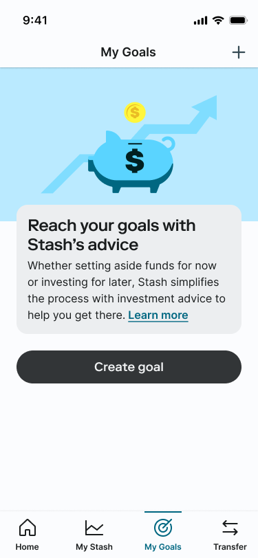
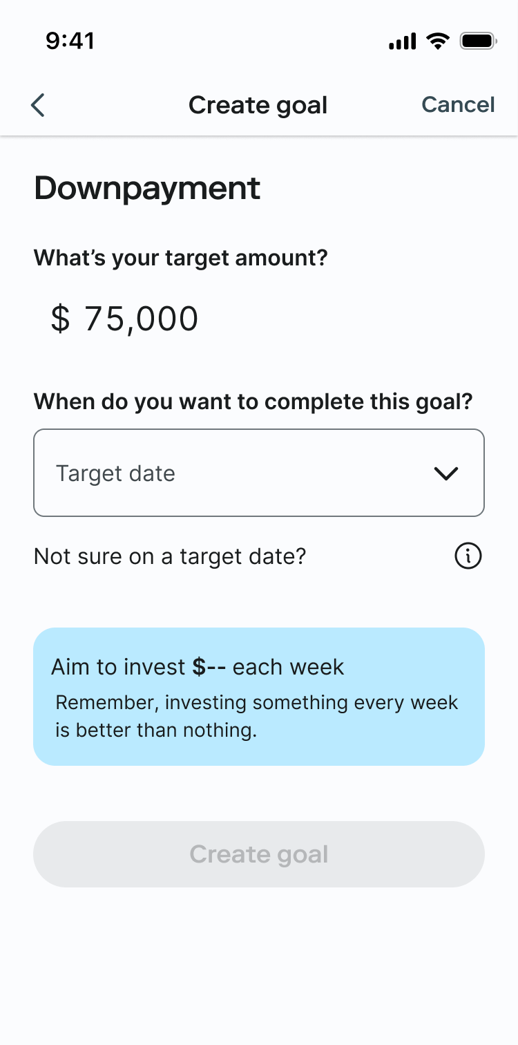
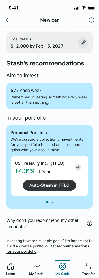
System-level handoff and continuous optimization
I delivered native mobile and web production files, mapping out intricate edge cases and error states alongside our Tech Lead.
Notably, I was one of the first designers to stress-test our company’s brand-new design system in production, collaborating directly with the Design System team to iterate on, validate, and contribute components back to our global library.
Measuring success
To evaluate the success of our new Goals feature, we tracked a few leading and lagging metrics. We structured our tracking around two core pillars: adoption and habit formation.
Goal creation rate: We monitored the gross volume of new goals created to measure initial interest. This metric validated our new onboarding experience, scaling from a baseline of 11,000 legacy goals over two years to 48,600 unique goals created within the first 5 months.
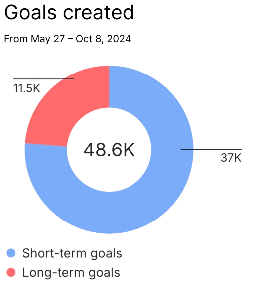
Habit formation: While setting a goal is a good first step, to actually reach your goals you need to form new habits. Making sure our users successfully invested after setting a goal meant success for both them and us as a company.
We measured how many users successfully created a recurring transfer into our recommendations, both as a whole and based on goal type (short- versus long-term). Overall, 24.6% of goals converted to recurring deposits, with users being more likely to convert for short-term goals at ~29% versus long-term goals at 13%.
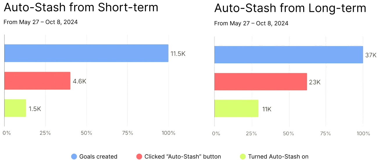
Our team's hypothesis here is that long-term goals don't strike the same level of urgency that short-term ones do. The fact that they are at least three years away and likely to be a greater amount was a blocker to our users actually saving for them.
The fast-follow: Visualizing progress
Post-launch metrics validated our core loops, but live feedback and support tickets surfaced a critical fast-follow requirement: users needed to see how their scattered automated investments aggregated toward their milestones.
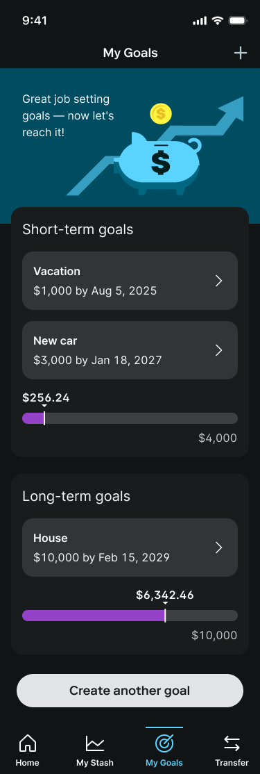
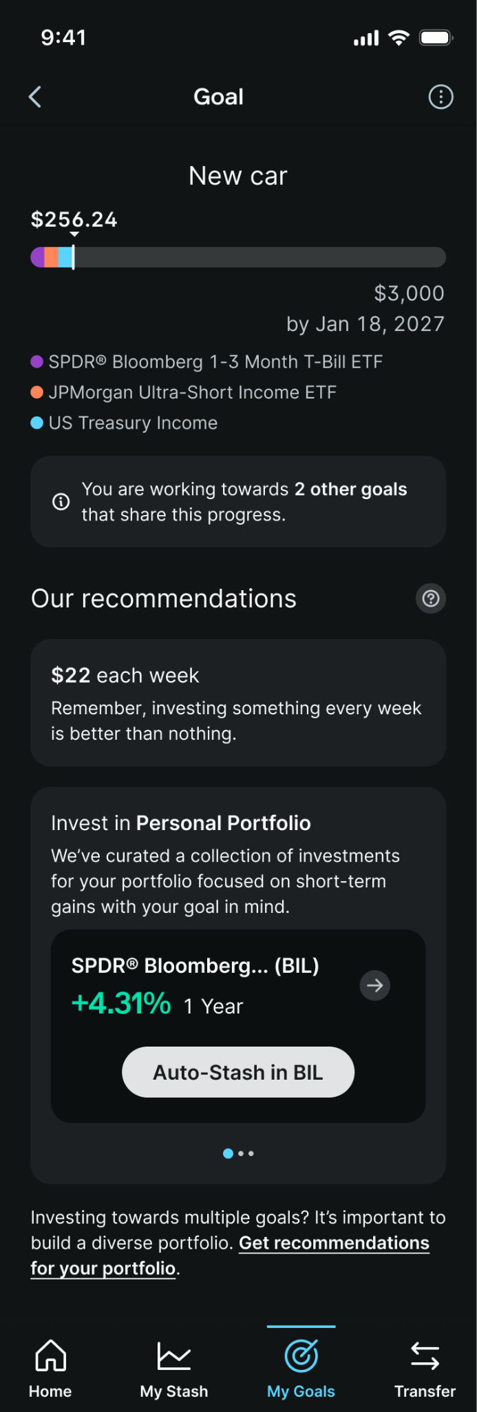
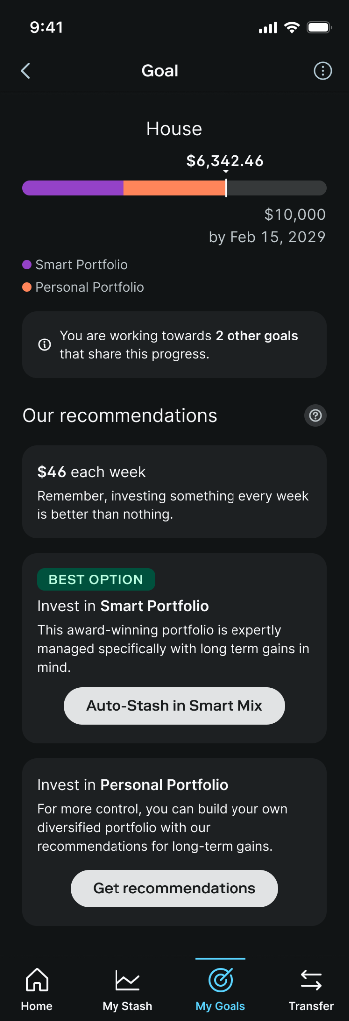
To break through internal ambiguity around data visualization, I facilitated a cross-functional leadership design workshop, translating collaborative sketches into high-fidelity solutions. When high-fidelity explorations proved too dense for a single screen, I simplified the information architecture by grouping progress into distinct, cumulative "Short-Term" and "Long-Term" visual buckets.
Retrospective
Data-driven decoupling
This project proved that trying to solve every financial milestone at once leads to platform bloat. Decoupling account creation from goal setting allowed us to launch a highly resilient framework that we could continuously scale.
System-first collaboration
Being one of the first to implement our company's new design system taught me how vital it is for senior product designers to act as bridge-builders between the product squad and the core systems team. Testing components in high-stakes production environments allowed us to stress-test the library and contribute stronger design patterns back to the global design org.
Previous project
Mobile app at RhoNext project
Transfers at Stash